
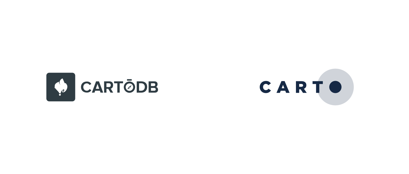
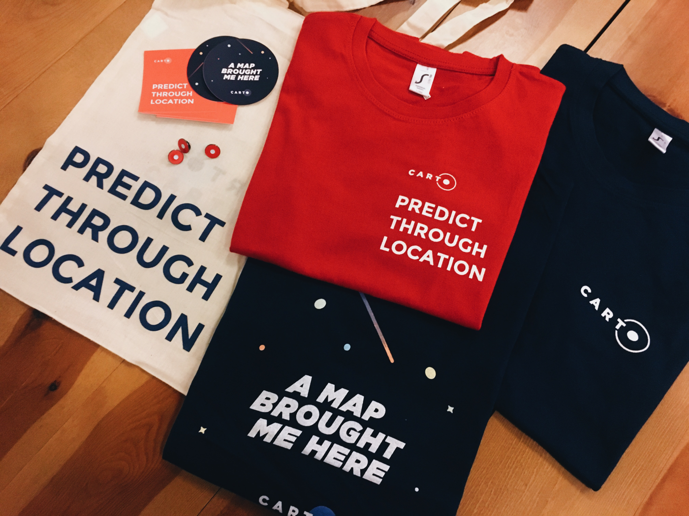
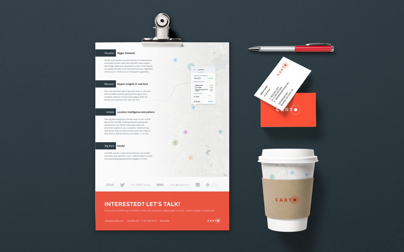
On July 7th, 2016, CARTO did a massive launch involving the change of the company name, a rebranding which led us to update every brand touchpoint, along with the launch of what would become the main product of the company.
While that product, CARTO Builder, had been in development for over a year, the rebranding was announced internally just a few months before, which meant having to recreate everything in a short period while still trying to keep our quality levels high and coming up with a bold and provocative new brand that would make the company stand out.
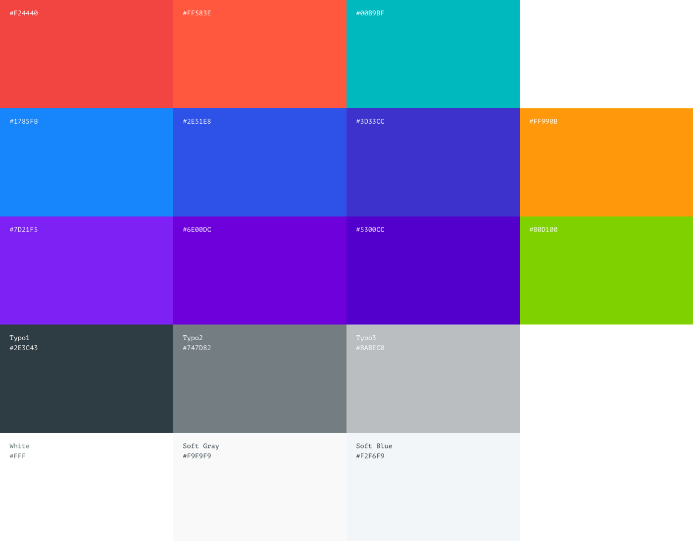
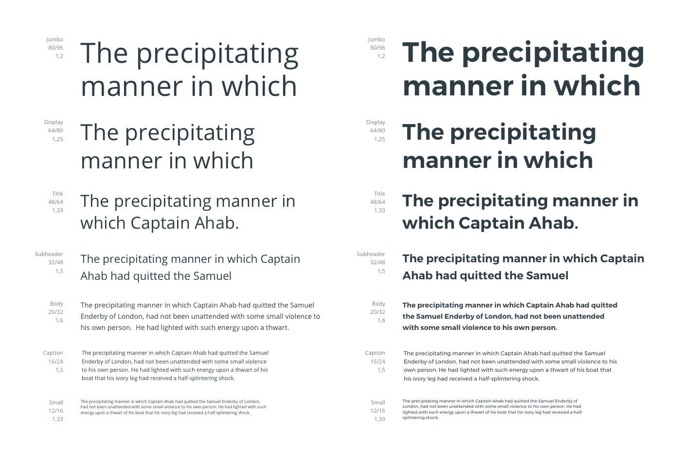
We went through all the steps, from research to the reframing of our brand values, from clearly defining our key differentiators within the industry to diverging through multiple ideas of what this new brand should look like.

We ended up with a basic framework that gave us plenty of flexibility not only to achieve those goals but, once the launch date had passed, to invest more time and thought in it in order to improve it while keeping its original essence.
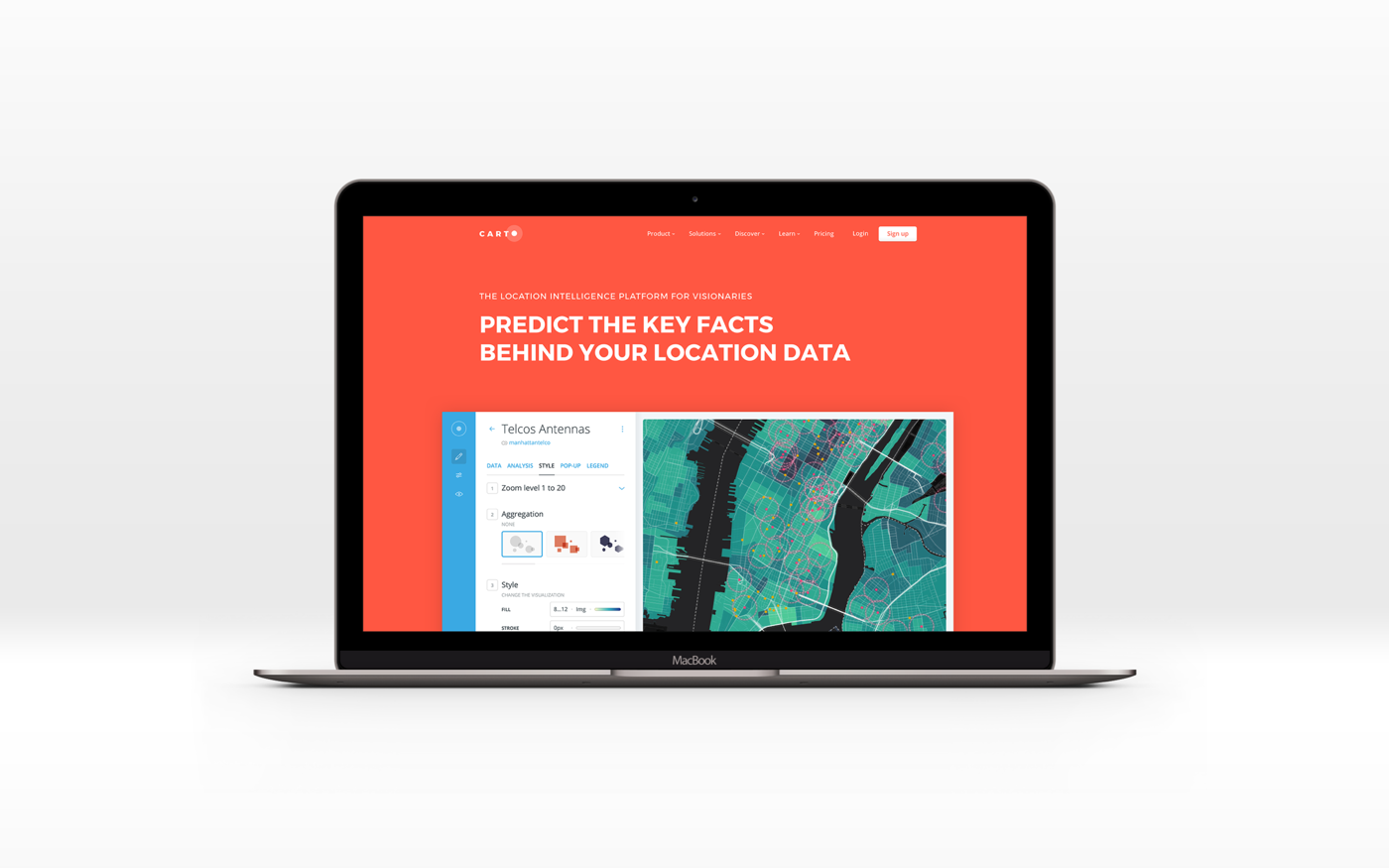
CARTO has position itself as a key player in the industry that stands out from the crowd thanks to its bold and modern image. Proud of having shake a very exclusive sector (until now mostly formed by highly specialized GIS experts) by democratizing Location Intelligence prioritising design at the front and center of everything it does.
As an extra, a video I made for a company deck.